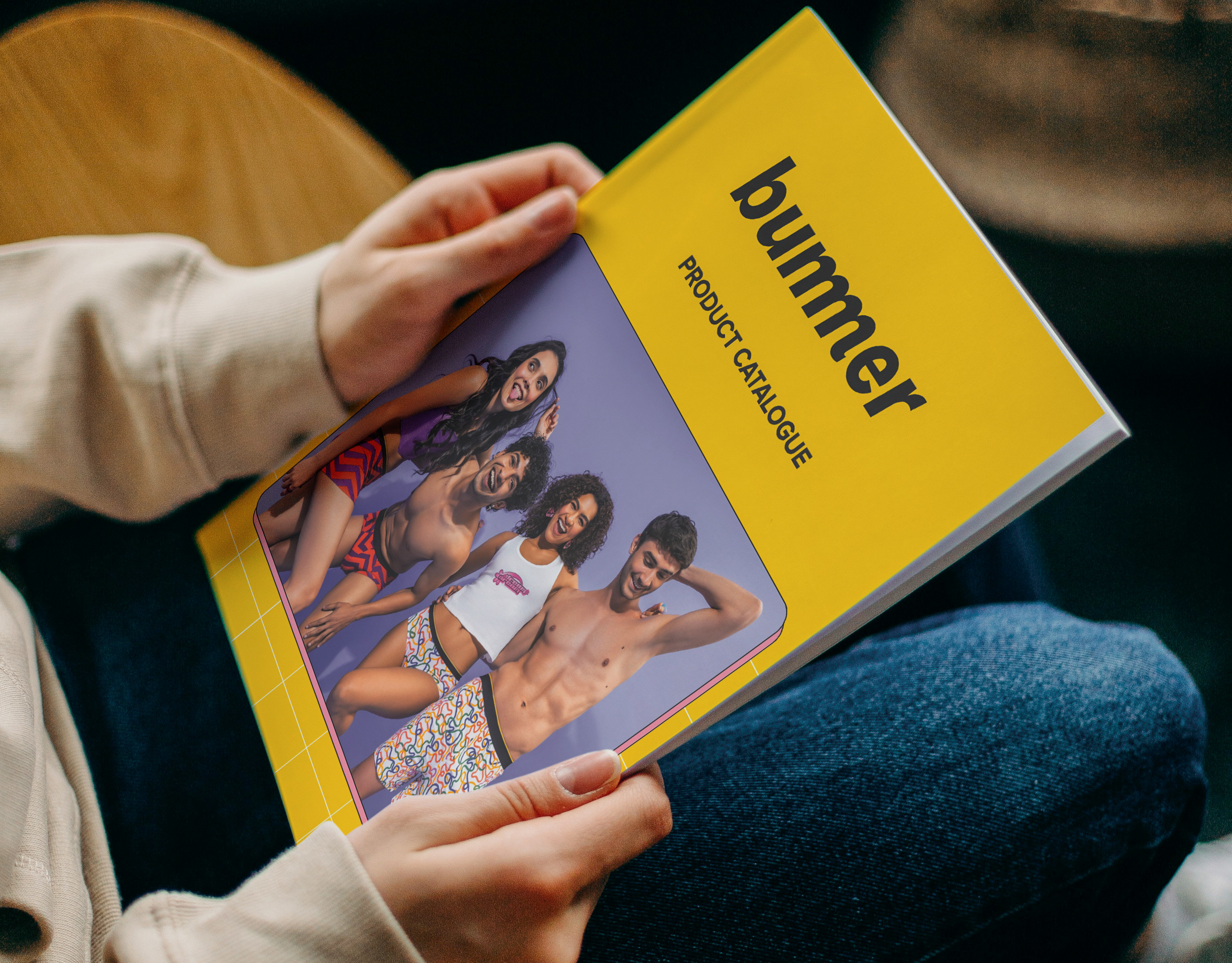
Bummer
Packaging Design | B2C Retail
Creative Direction · Packaging Design · Audience Analysis · Competitive Analysis
Clouds For Bums - Not Just Online Anymore!
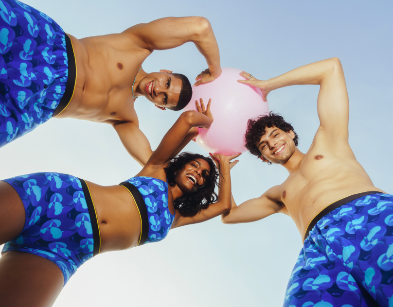
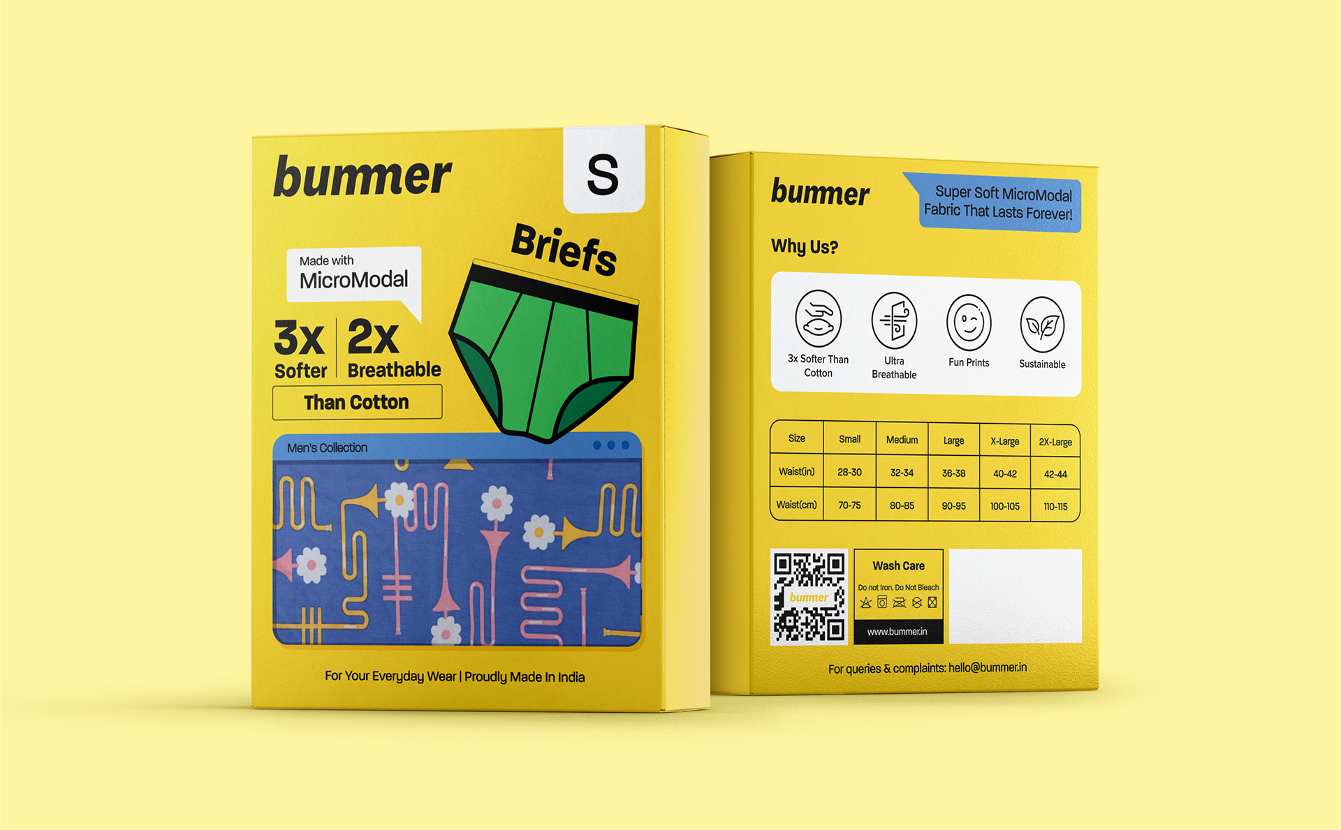
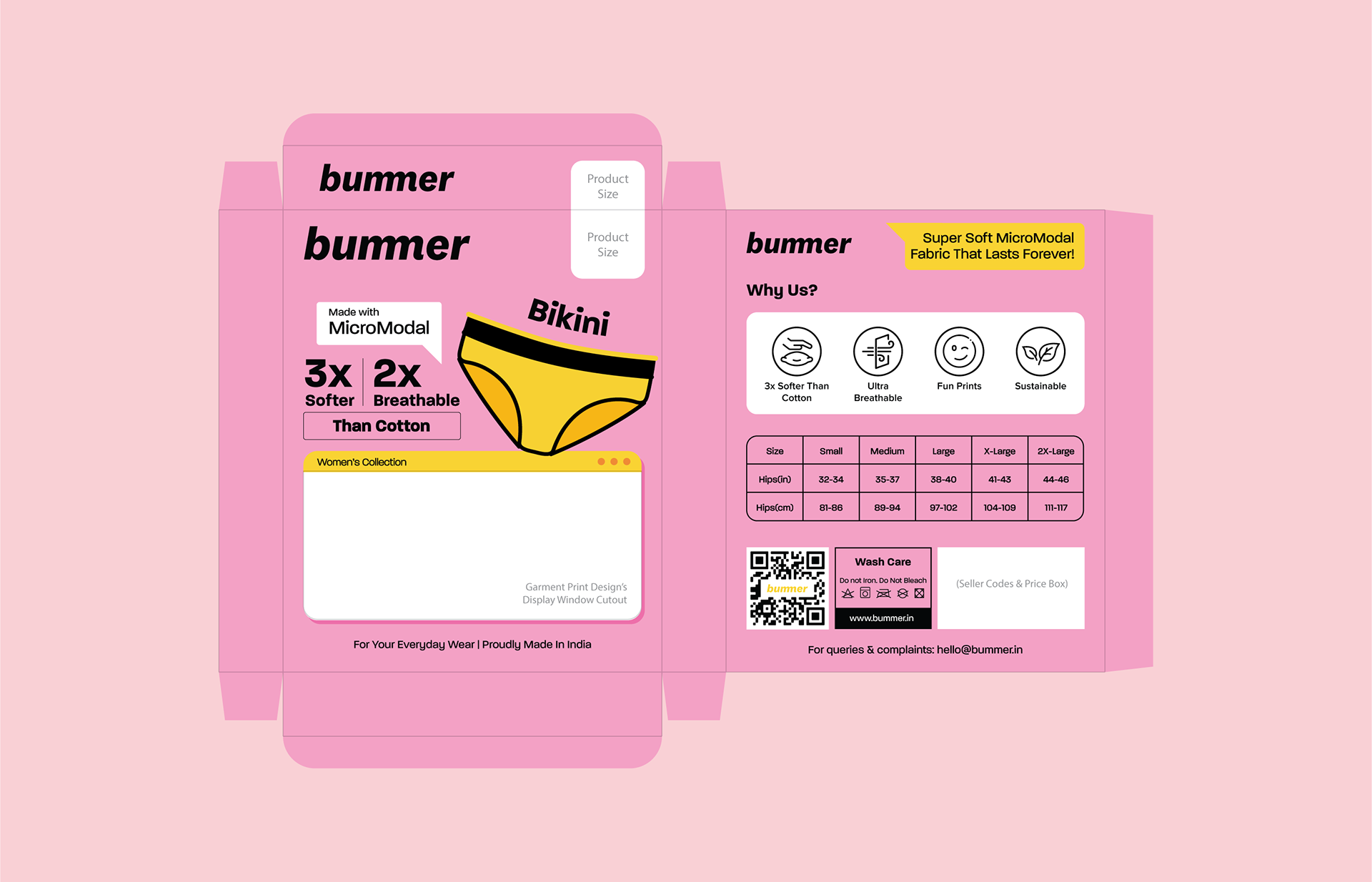
Bummer is a bold, fun and quirky inner-wear brand that redefines comfort with bold & quirky prints, with an unapologetic sense of fun.
In this project, I conceptualised and designed Bummer’s new offline packaging for its B2C retail channel. The design was rooted in comprehensive research and built on our existing design language to ensure a cohesive brand experience.
Packaging Design (B2C Retail) - Research
Existing Packaging Design (D2C Online) - Front & Back:


Research & Analysis:
I conducted an open-ended survey with a sample group of our target audience to understand how they perceive their inner-wear purchasing behaviour and what role does its packaging play.
Here are the key questions we asked:
Here are the key questions we asked:
- What would catch your eye first when you look at an inner-wear packaging in a store?
- What all information would you usually want to know in an inner-wear product before buying?
- What all information would you usually want to know in an inner-wear product before buying?
- What makes a packaging design feel premium or trustworthy to you?
- What would make a product unappealing to you solely based on its packaging?
- How important is a branded appeal to the product for you?
- What would make a product unappealing to you solely based on its packaging?
- How important is a branded appeal to the product for you?
- What kind of visuals or elements help you quickly understand the product?
- Is there anything else you'd like to see on inner-wear packaging currently no brand is offering?
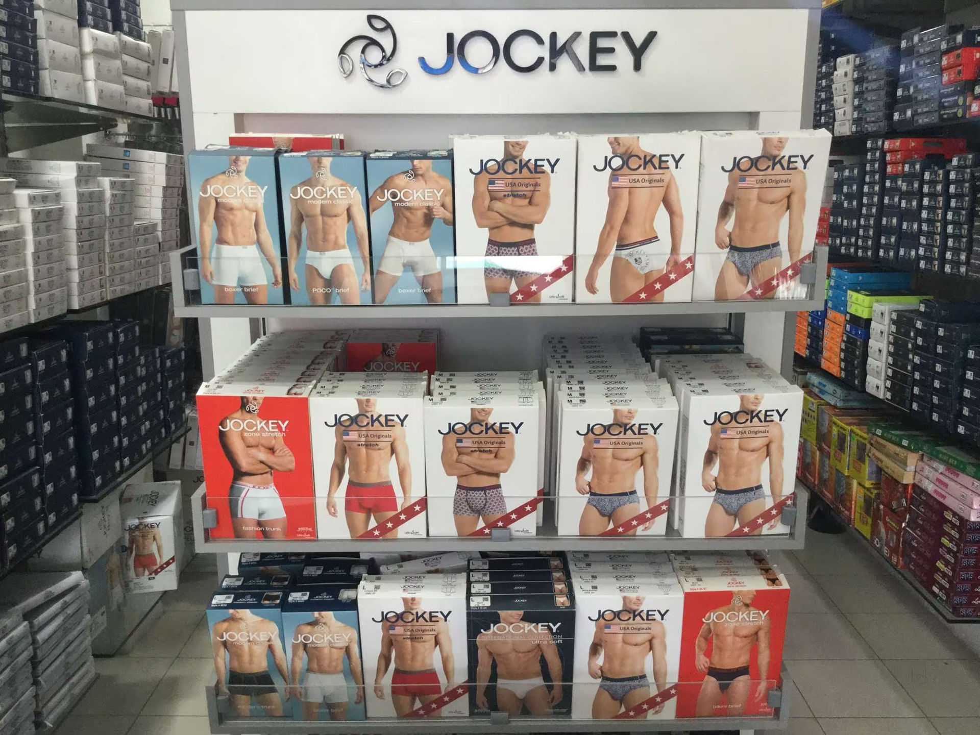
Jockey's product rack in a shopping centre. Multiple brand's packaging were analysed as part of competitive & market analysis
Key Insights From The Survey:
- Most important features of the product which is also relevant to their need would attract them the most.
- Buyers wanted instant clarity on product category, size, and one strong USP.
- Most important features of the product which is also relevant to their need would attract them the most.
- Buyers wanted instant clarity on product category, size, and one strong USP.
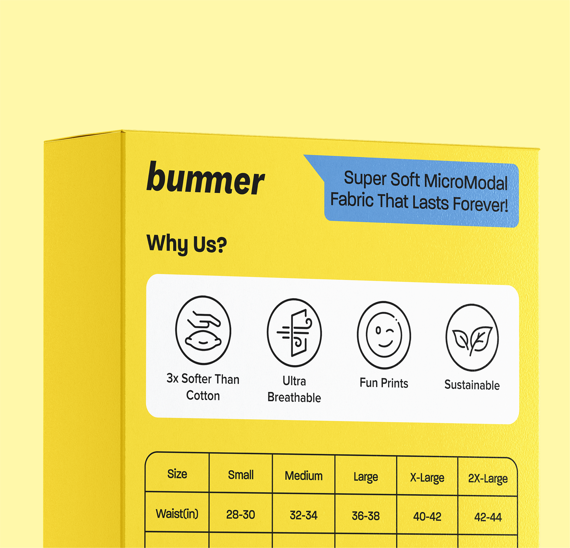
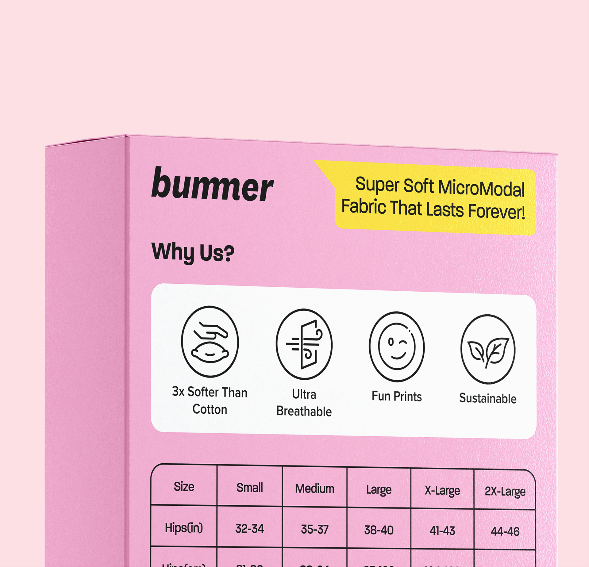
Users valued small details like wash care, size guides, and links to socials/website.
- Clean and structured designs were preferred over cluttered or overly colorful layouts.
- A prominent brand logo helped with recall and built trust.
- Icon-based info on the back improved usability and understanding.
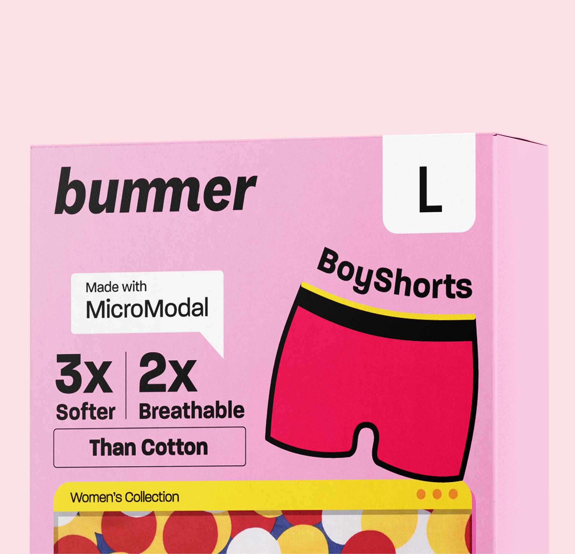
- Our audience found packaging with model images repetitive—highlighting prints instead made the product feel more unique.
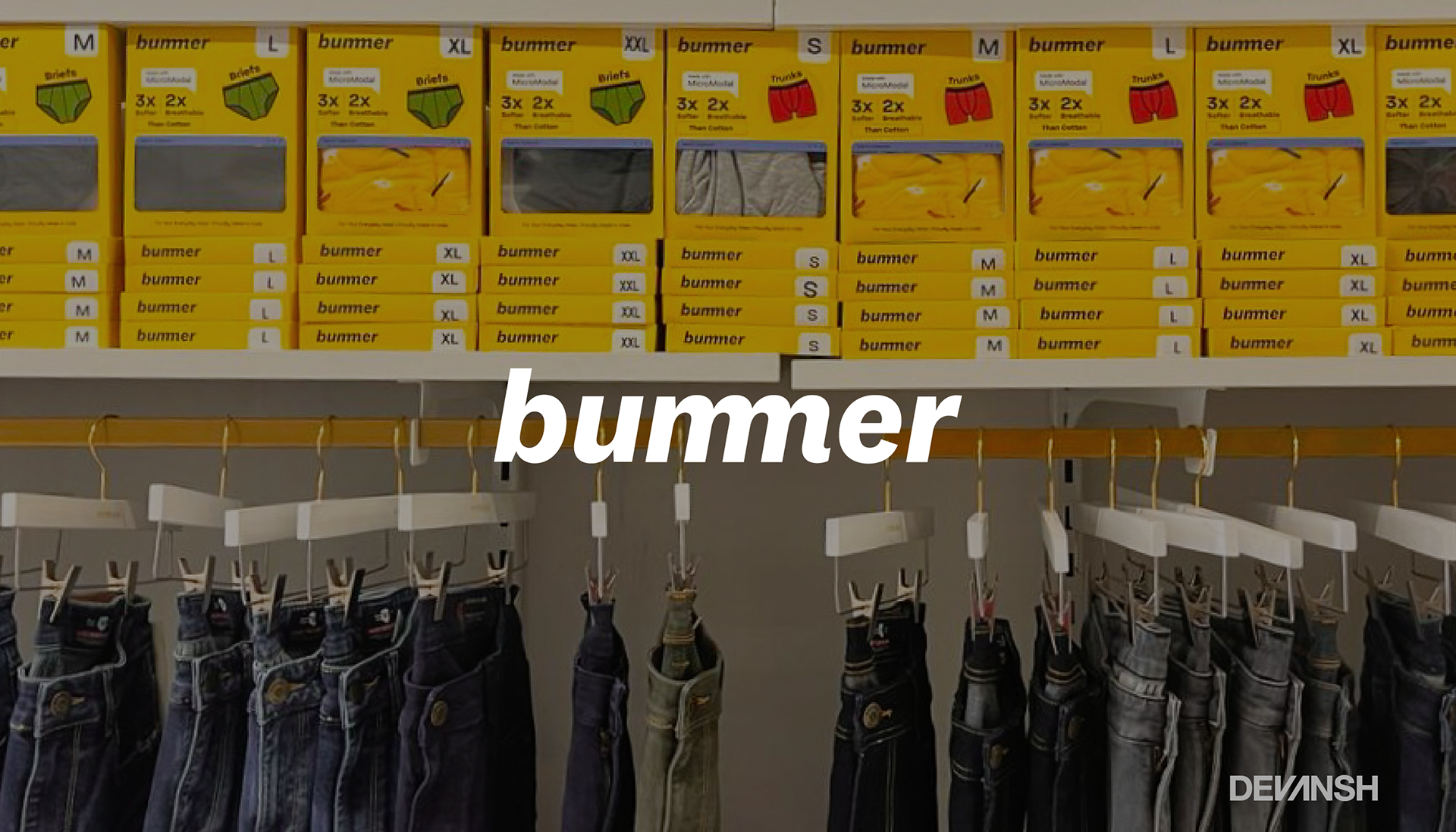
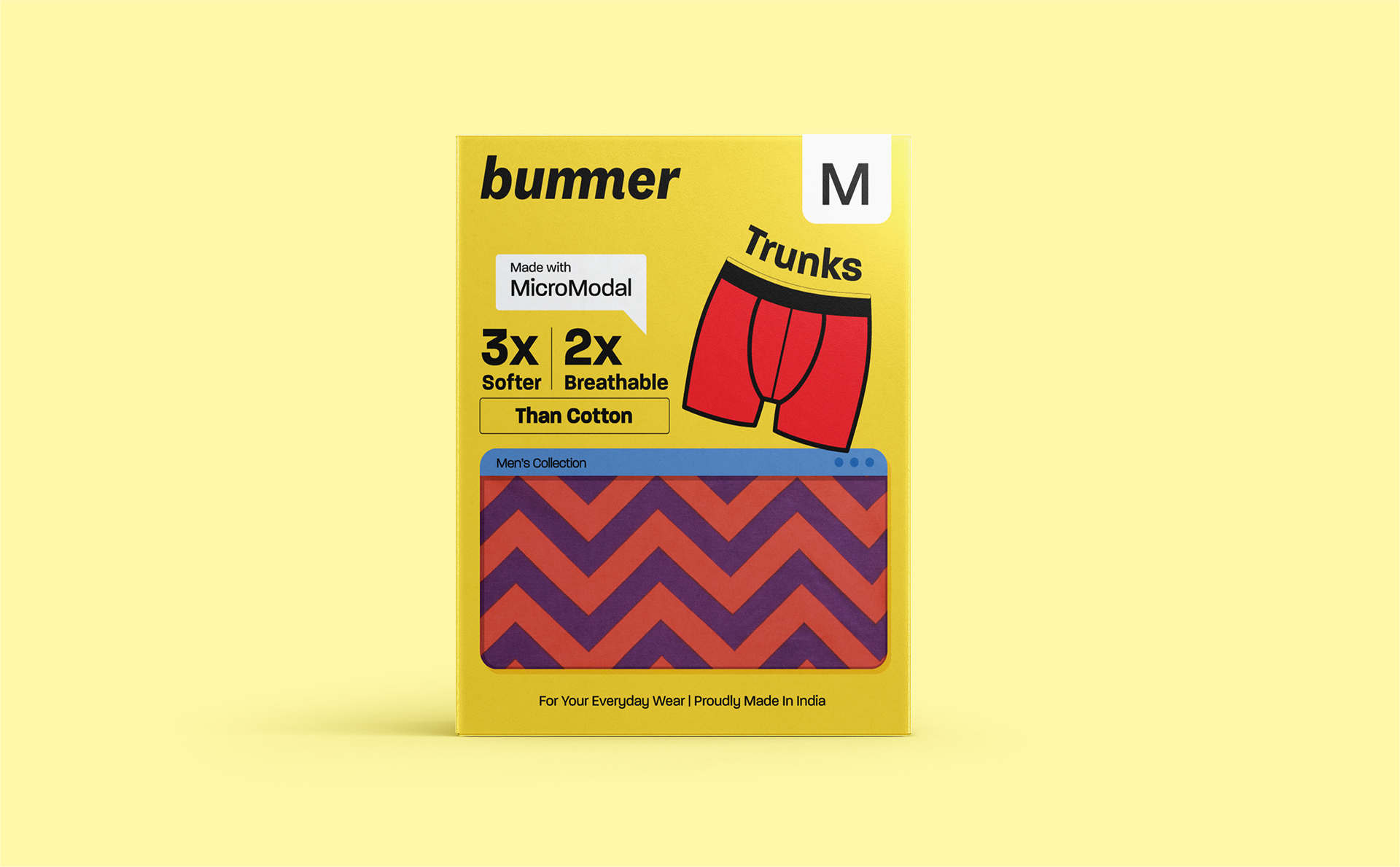
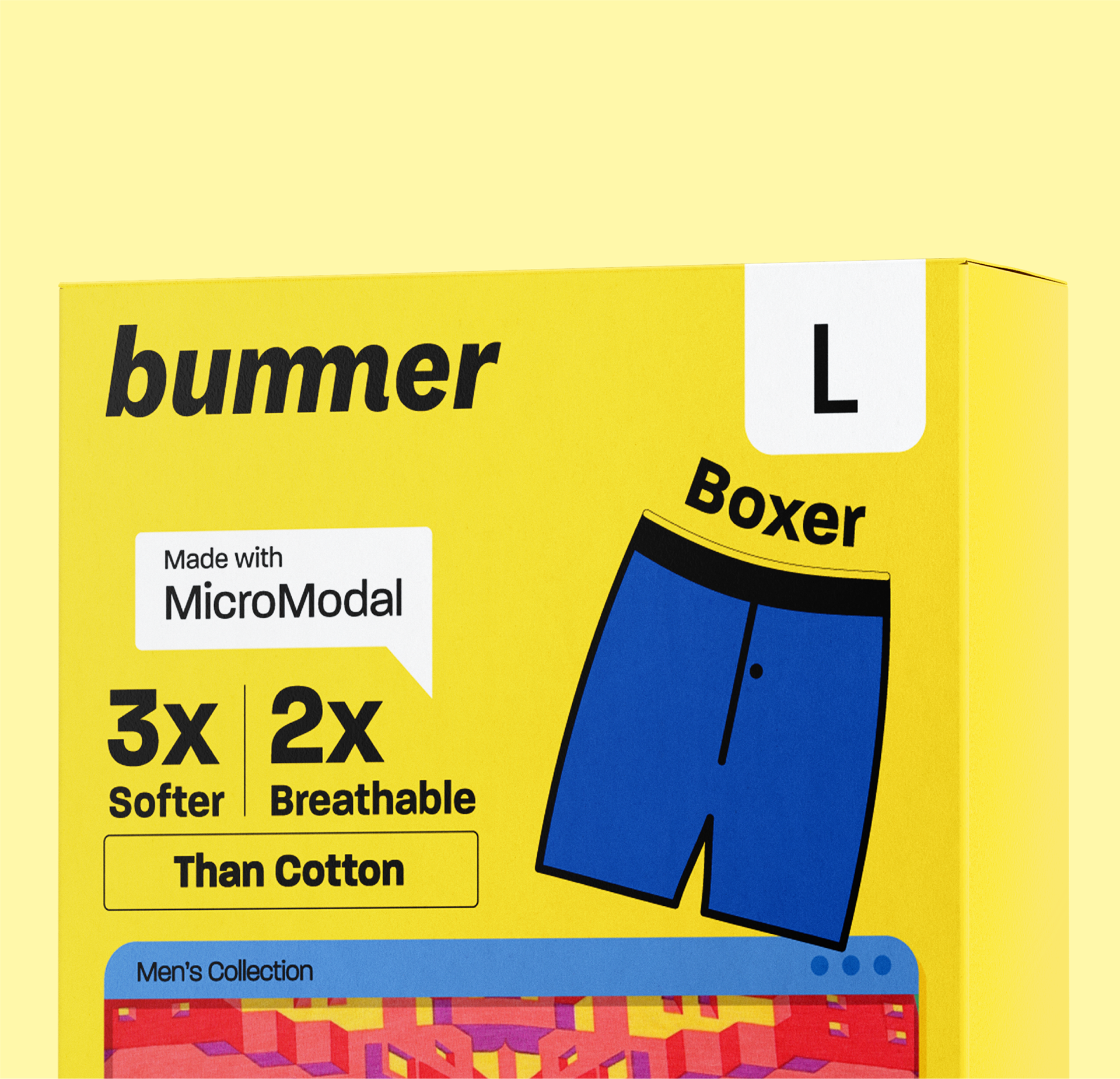
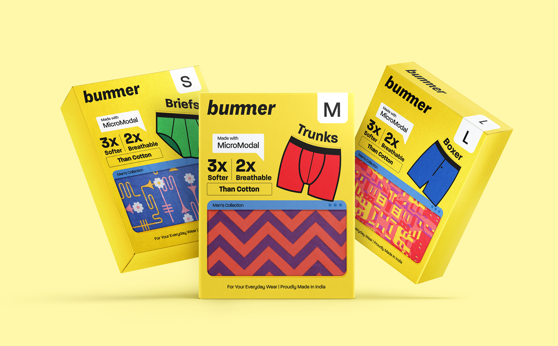
Packaging Design (B2C Retail) - Final Design
Men Version:

Women Version:

Packaging Design (B2C Retail) - Mockups | Men:

Packaging Design (B2C Retail) - Mockups | Women:


Real World Packaging Images
In-store | Lifestyle Shopping Centre:

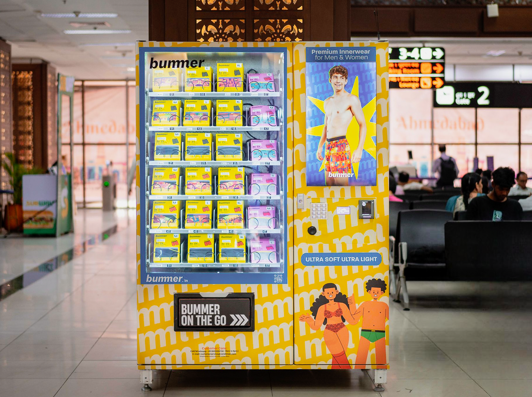
Vending Machines | Airport:
In Conclusion
I focused on making our two key strengths—the unique prints and fabric quality—the hero of the packaging, visually bringing them to the forefront. Blended with our bold design language, this approach stood out in retail spaces crowded with competitors. The new packaging proved to be a strong success, driving attention and interest for a young brand like Bummer.